25 Simple Guidelines And Tips For Creating Better Landing Pages

0
54
Landing Page, Website, Design, Web, Seo


Here are WordStream’s top 10 favorite landing page optimization tips: 1. Keep your landing pages focused and relevant to the keywords you’re targeting. 2. Make sure your landing pages offer a clear, persuasive value proposition. 3. Use a strong, relevant call to action on your landing pages. 4. Use engaging visuals on your landing pages, including images, videos, and infographics. 5. Keep your landing pages free of distractions, including navbars, sidebars, and links to other pages on your site. 6. Use a simple, concise, and easy-to-read font on your landing pages. 7. Make sure your landing pages are mobile-friendly and responsive. 8. Use A/B testing to test different landing page elements and find what works best for your campaigns. 9. Keep your landing pages updated with fresh, relevant content. 10. Monitor your landing page performance regularly and make changes as needed.

We’ll show you how to increase conversions on your landing page by testing and tweaking essential elements.

1. Keep the messaging between ads and landing pages consistent

You would be surprised by how many advertisers do not do this, even though it might seem obvious. If the ad and the landing page do not match, it is the same as if the URL in the ad did not work.

2. Radically change the sign-up flow of your landing pages

Button colors and font kerning might seem like they would make a difference, but they actually don’t have a significant impact and you’re missing out on opportunities for more conversions.

You will only see big results if you make big changes, one of which is changing the sign-up flow for your landing pages.

The landing page offers three different ways for prospects to sign up, depending on their individual needs. This reinforces the sense that the user is in control and can choose their own course of action.

3. A/B test the position of forms on landing pages

Many marketers are too focused on the forms for their landing pages without considering where those forms should be placed.

In this post, Aaron Levy strongly recommended testing the positioning of landing page forms on your pages to see considerable gains in conversions.

A/B testing allows you to test two versions of a page against each other to see which one performs better in terms of conversion rates. This is the best way to see what elements of your page are not working as intended.

For example, you can compare how two different styles of buttons perform, or which headlines are more eye-catching. Keep in mind that you should only test two versions of a single element at a time; otherwise, you won’t be able to get an accurate measure of the difference.

4. Make your landing page forms mobile-friendly

If you’ve never filled out a web form on your mobile device, you can’t expect your prospects to do the same. This is an important tip in our upcoming post about landing pages, and for good reason.

The reason that mobile ads are so effective is that they take advantage of the fact that consumers want to buy something immediately. This means that your mobile landing pages need to be designed so that it is easy for consumers to convert while they are on the go.

5. Craft a killer call to action

If you’re still using “Submit” as your call to action, you need to change your strategy.

Your visitors simply won’t know what you want them to do next. A call to action is an important aspect of a landing page. Without a strong call to action, the user may not know what the desired outcome is.

6. Use the voice of the customer in your copy

Copy is just as important to the success of a landing page as design considerations. “The voice of the customer” is one of the best ways to create a compelling landing page.

It is far too common for landing pages (and marketing materials in general) to be full of marketing buzzwords and terminology that have been copied directly from sales training manuals. This is especially true for enterprise-level businesses, which often seem to think that the more confusing the language is, the better.

The main selling points of the offer need to be emphasized from the perspective of how it benefits the customer, rather than how technically impressive it is or how many clients the company has.

7. Use power words in your landing page copy

When you use the voice of the customer in your landing page copy, it is powerful. Adding “power words” can make your pages much more effective.

8. Include video on your landing pages

An advantage of adding video to your landing pages is that it can be helpful in conveying a complex idea without burdening your visitors with a lot of text. In addition, video can be a great way to support your overall messaging and branding.

9. Use new ad formats and get rid of your landing pages altogether

We are recommending using a truly bold strategy and getting rid of landing pages altogether. Even though this may seem strange or crazy, today there is no real need to force prospects onto a landing page.

10. Use call-only campaigns

As compared to desktop searches, users are NINE times more likely to convert from a mobile SERP (search engine result page). Given that calls to businesses are worth at least three times as much as clicks, there is a strong argument for using Call-Only campaigns instead of traditional landing pages.

AdWords’ Call-Only campaigns let you include a phone number that visitors can click on to call your business directly from your ad. With this feature, there is no need for clicks, web forms, or landing pages, which allows users to get straight to the point.
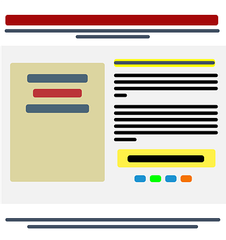
11. Make Sure You Target the Right Audience

It’s important to take the time to make sure you’re marketing your landing page to the right target audience before making any changes.

Ask yourself:

  • Who will read this page?
  • What do I want them to read?
  • How do I want them to feel?
  • What do I want them to do?

Make sure your page has a clear purpose that is aligned with the questions posed in the headline and body copy. Include testimonials and call to action buttons that help to reinforce this purpose.

12. Write headlines that connect emotionally

Your headline is the most important part of your landing page because it is the first thing users see. You only have a few seconds to grab their attention, so it is important that your headline is bold, straightforward, and resonates with your audience.

Your headline should make a promise to the reader and entice them to read further.

13. Ensure your copy understands the problem

If you are having difficulty articulating how your product or service can address a particular issue, a copywriting framework may help to ensure that your message is effective.

When you tell a story using the following framework, visitors typically convert at a higher rate:

  1. The story with a character like them
  2. who has a similar problem
  3. and meets a guide like you
  4. who offers a plan to solve that problem
  5. and invites them to take action
  6. which helps them avoid failing
  7. ending in success.

This framework allows you to understand what your audience is looking for and how to craft a clear message to address their problem.

14. Offer something users value (above the fold)

You can easily squander valuable real estate on your landing page by going into too much detail about your business right away. The reality is that people don’t really care about that.

In other words, you should explain to potential customers how your product or service can improve their lives and solve their problems as soon as they arrive on your page. If they want to learn more about you and your product, they can keep scrolling down the page.

15. Use the right images

While it is very important to have a well written message, sometimes images can better convey the emotions needed to get users to take action. Every image on your landing page should be carefully selected to match the content and help your message stand out.

The images on their page show visitors what success looks like, step by step.

16. Include reviews and testimonials

Many prospects will read reviews and testimonials before they make a purchase.

Customers trust other customers to give them an accurate portrayal of a product or service. If they see that people are happy with your product or service, they’re more likely to take action and buy.

17. Add trust badges to reassure visitors

Applying trust badges to your page will show customers that their information is safe with you, which will persuade them to stay on your page and continue browsing or shopping.

The basic idea is that if someone has not visited your landing page before, it will be difficult for them to know if they can trust your brand.

With a trust badge, you can show that you are a credible and trustworthy source by borrowing authority from trustworthy brands.

18. Remove your navigation menu

If you’re thinking of adding a navigation menu to your landing page, you might want to think again. Studies have shown that having a navigation menu can actually decrease your conversion rates. So if you’re looking to increase the number of people who take your desired action on your landing page, you might want to consider leaving the navigation menu off.

Having too many links and a complicated navigation bar can be confusing for visitors and take away from the main purpose of the page. It’s important to get rid of anything that might distract someone from what you want them to do on the page.

19. Limit the number of form fields

If a brand tries to collect too much information from a prospect all at once, the prospect is likely to not convert.

Consider the position of your landing page within your sales funnel, how much information is really required, and what benefit you are offering in exchange.

If you want more conversions, simplify your forms. The fewer form fields you have, the more likely someone is to fill it out. Most landing pages include 2-3 form fields, such as the visitor’s name and email address. You can always ask for more details later on in the customer journey.

20. Test button colors, size, shape, and placement

The color, text, and placement of your CTA button can have a big impact on your conversion rate. People tend to respond to CTAs differently depending on where they are in the buyer’s journey.

21. Answer questions before they’re asked

If you can answer common questions that people have before they even ask them, it makes people more likely to take the action you want.

One way to reduce customer complaints is to include a section on your website with answers to the most popular questions customers have. This will allow customers to find the answers to their questions without having to contact customer service.

22. Use a live chat tool

You can speak to your audience directly with a live chat tool, which can help address objections.

When people know that their concerns are being heard, they tend to respond better. Therefore, by using a live chat plugin on your landing page, you show that you care about your audience’s experience and satisfaction.

23. Add visual cues to important content

Directional cues guide people’s attention to specific parts of your page. They are like visual “pointers” that help people understand your layout and find the information they need.

Cues such as arrows can be used to direct attention to elements like buttons that you want people to interact with.

24. Optimize your page for speed

Although you may spend hours creating the perfect landing page, it does not matter if your loading times are high. If your landing page does not load within a few seconds, you will most likely lose your visitors as they will go to a different page for a better experience.

You need a fast landing page if you want people to convert. Check your page loading times with a free website speed test tool like IsItWP.

25. Monitor on-page behavior

If you’re not monitoring user behavior on your landing page, you’re missing out on valuable insights. By tracking what users do before they click your CTA, you can identify areas for improvement to improve the overall flow of your page.

Heat mapping allows you to see how users interact with your website.

For example, you may notice that people are more interested in your social media buttons than your CTA, which suggests that you should remove them from your page or your blog.

We’re interested in hearing about optimization strategies that are working for you and your blog, specifically which ones from the above list you’re using and which ones you’re thinking of trying out.


LEAVE A REPLY

Please enter your comment!
Please enter your name here